Cleveland Underground
Brand Identity Design, Package Design, Art Direction, Marketing Material Design
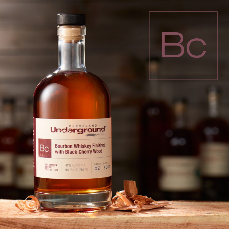
For generations, oak has been used to age spirits simply because it has the right pore structure to hold liquid. It’s hard, if not impossible, to make a barrel out of black cherry, hickory, or honey locust that doesn’t leak like a sieve. And yet there are so many untapped flavor profiles that can come from these woods. Cleveland Whiskey captures those flavors in their Underground line – letting creativity and innovation shine.
The Approach
Cleveland Whiskey is guided by imagination and innovation. For this uncommon barrel line, they pushed the boundaries to produce a line of whiskies that is experimental and unquestionably different.
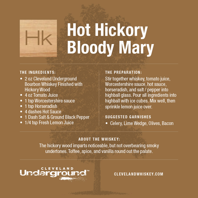
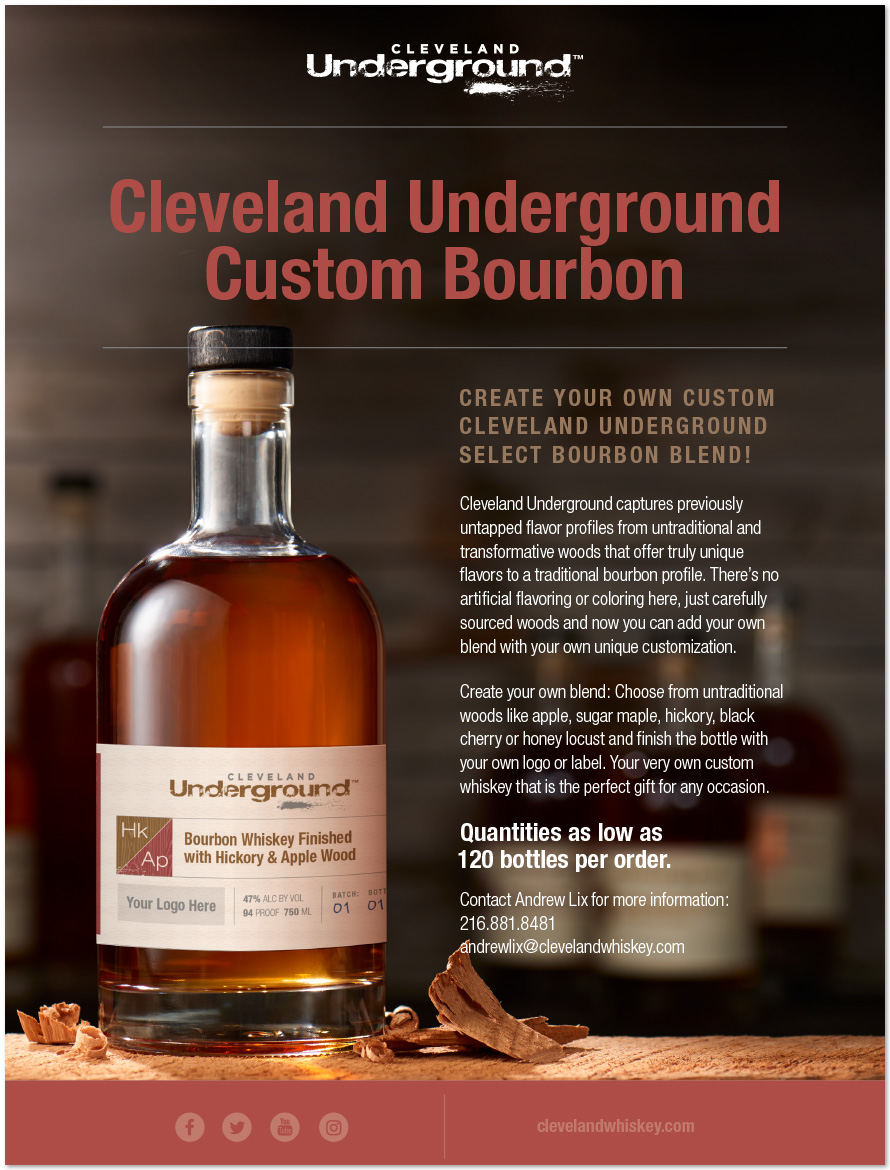
The design concept emphasizes the science behind their whiskey making process and gives each flavor it’s own periodic table symbol (Sm = Sugar Maple, Ap = Apple, etc.). Paired with a strong emphasis on color, wood textures, and tree illustrations we created a unified family of products that can easily be expanded upon. The design reinforces the idea that the flavor of the whiskey isn’t artificial. The flavor is coming from the different woods used.